Saturday, November 13, 2010
Impulse! Records Gallery #1: 1 to 25
One of the main touchstones for album cover design is the Impulse! Records catalogue - or, that is to say, one of the main touchstones is 1960s jazz cover art, as best exemplified by Impulse! Records. I'm not sure that the 1960s Impulse! catalogue is really quite as revolutionary as many would have you think, but if nothing else they are certainly iconic (so much so, in fact, that their impact might have been blunted by the very extent to which they've entered the popular consciousness) and evocative of the style of music presumably held within: modern, tasteful, and most of all, cool. I think these covers are about the best visual representation of 'cool' out there.
I'm going through the catalogue according to catalogue number, not chronological order. Presumably, they're roughly the same, but inevitably never quite are. These are numbers 1 to 25.

The first one, and already the ethos is there: a great cover photograph, in this case two very hip men with their trombones and an attention-grabbing strip of yellow, and a lot of text in a clean font with different colours. The text is a bit too in-your-face, but they're getting there.

This is the Impulse! look exactly. Clever 'math' title in bright colours and a dignified font, beautiful mysterious live photo that is mostly black in colour. God knows how much black ink got used at the Impulse! printing press.

Two of the first three Impulse! albums are by a trombonist I've never heard of. This is less iconic, and kind of Martin Denny/'exotica'-styled, but it's clever, with Mr Winding's trombone quite literally in-your-face.

This potentially could be cheesy, with Gil Evans on a chair staring at the giant hole that's formed in the wall next to him. But somehow it works, with lurid reds paying no attention at all to the album title.

Impulse! could have stopped here. That blue-tinted monochrome close-up, that modish sixties text in complementary colours... this says everything you need to know about jazz album art.

A bit knocked-off by comparison. Mostly because the cover art fails to impress, I guess, looking like 'just any old photograph'. Nice colour scheme though, evoking the pan-African colours.

It wasn't easy to find a good picture of the cover for this album, perhaps because its exclamation-point-overdose title is tough to Google. Art Blakey seems happy enough, drumming in the pitch black. Happy? That's not something you see on many of thse covers.

Nice, but the approach is already slipping into cliché. This is Impulse!-cover-by-design. The results are good but not gorgeoush, and way too much importance given to record label logos (I'm guessing that garish GRP logo was tacked on later).

The obvious follow-up to 'Out of the Cool' doesn't apparently, feature Gil Evans at all except on the cover. They've patched up that red wall well enough.

More of the same, let's be honest. It's a good 'same', with Coltrane the colour of lava and nothing else but his instrument up close and blurry plus a lot of blackness. A baby blue strip houses the logo and winds up drawing the eys perhaps more than it should.

It all comes down to the cover photo, I guess. This is a beautiful, sombre, thoughtful picture, so the cover is a success. That baby-blue sure sticks out, doesn't it?
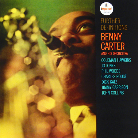
Green and yellow! Where did they come from? A very 'bokeh' picture turns Carter's sax into a mess of bright colours, but it puts some energy into a series of beautiful but sleepy covers.

Monchrome on deep black, bell of the instrument in close-up. Text in all caps with complementary colour scheme. Yep.

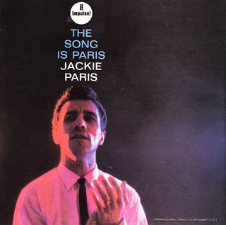
I had a hard time believing this was legit, since it seemed to be typeset in Courier New. Then I remembered that there used to be a thing called a 'typewriter'. Otherwise, very standard. Pretty, but standard.

It's amazing in rapid succession just how samey these are. Impulse! certainly attracted big names, though, didn't it?

A change, this time out, in that it's an illustration and not a photograph. Still, a noteworthy change. It gives the album a different feel, even if it's still monochrome with lots of black.
Interesting. Being off-centre is a nice touch. It has the 'cool' that I think some of these other covers were starting to lose, even if the text looks like it's piled up on the guy's head.

Pretty, if generic. The photo is clearly posed this time, and why not? Why have all your covers be live peformances? Otherwise, italic, yay.

Manny gets just a tiny filmstrip. This is what cheesy discount album covers looked like in the 60s, but they were presumably copying this and not the other way round. The tracklist takes up most of the cover, but it's still a nice change. Even if it's still really, really black.

Now this is cool. This guy could be a country singer, a prison inmate, or the president of France. Whoever he is, he oozes cool from pockmarked pores. Brown not black, and the numbers look nice. Like an evil 'Sesame Street'.
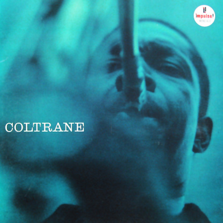
A pretty well-known cover. Actually it looks like very little thought went into this, but it stands out because blue is the dominant colour and black is secondary, not the other way round. Apart from that, just Coltrane in performance.

And this is lovely indeed. The cover this time is designed, not merely assembled according to specific rules. Two silhouettes look at each other in front of a red background. At first glance it looks like abstract art. Nice.

Very unexpected from Impulse! The quartet in a foret somewhere, looking lost. Very green, and way more pastoral than Impulse! records tend to be. The first cover that actually looks like it wasn't shot sometime past midnight.

Interesting for being text-based, like "Jazz Goes to the Movies" in black with a tiny photo, but this kind of looks like the dust jacket of a million 1960s books that I find in yard sales everywhere.

The last one, this time out in part one, this is a folk singer, of all things. It's a thoroughly Impulse-ised cover, though. He still looks like Woody Guthrie, but the cover's dark black and the text is in cool colours, all-caps. Fusion!
Subscribe to:
Post Comments (Atom)
Beautiful. Some of the best sleeves ever. How about some Blue Note as a companion piece? I love Impulses use of brown/tan and blacks. The blue of the Oliver Nelson and Coltrane releases here are cool, too. How it should be done.
ReplyDeleteเล่นเกม joker123 slot online เครดิตฟรี
ReplyDeletehttps://www.slot4u.com/joker123
With a lot of people commenting we tend to be driven here by traffic. I propose to thos who'd like to 5 meo dmt, 5 meo dmt buy or to 5 meo dmt buy online and buy 5 meo dmt. Finally like free, get to lsd tabs and lsd gel tabs or lsd tabs price.
ReplyDeleteotona love ラブドール通販店 | ブランド正規品 | 最安値直販店: https://otona-love.jp/
ReplyDeleteおとなLOVE (otona love) は正規直販店であり、自分の生産現場を持っております。第三者に通らず生産現場から直接顧客に配送するため、TPE素材や高級シリコン製のラブドールを低価格高品質で入手できます。また、正規代理WMDOLLラブドール、6YEDOLLラブドール、メーカーから直接消費者の手元に届くようなサービスを提供させていただきます。品質保証、安心・安全への取り組み。また、新着ラブドール 特別価格¥59999円から(税込み) 新着分解型ラブドール特別価格¥66,999円から(税込み)
Nice article. Thanks for the post.
ReplyDeleteInterior designers in coimbatore
Top architects in coimbatore
A smart home is an unstoppable development of the future. GaoMon Home Official (https://www.gaomon.com/) invest in the research and development of smart home devices that allow you to experience advanced technologies in your home that ultimately make your life easier and more efficient. We want to help you live a more productive lifestyle, create more free time for you, and let you pursue your dreams.
ReplyDelete